
Templedit
Template Management
Templedit section is located in Administration (gear wheel) > Settings> templedit.
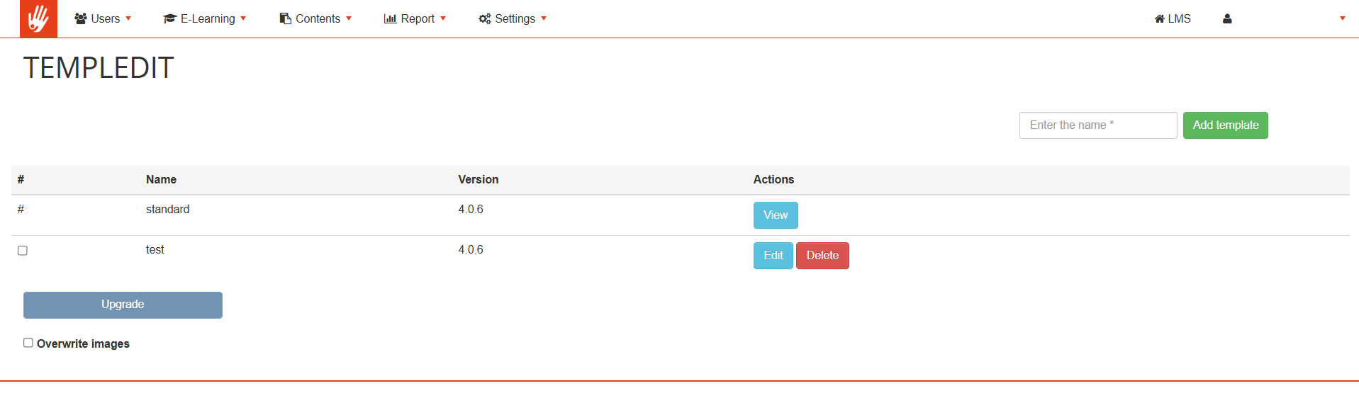
From this page you can see a standard template, and you can create new templates, edit and update the existing ones.
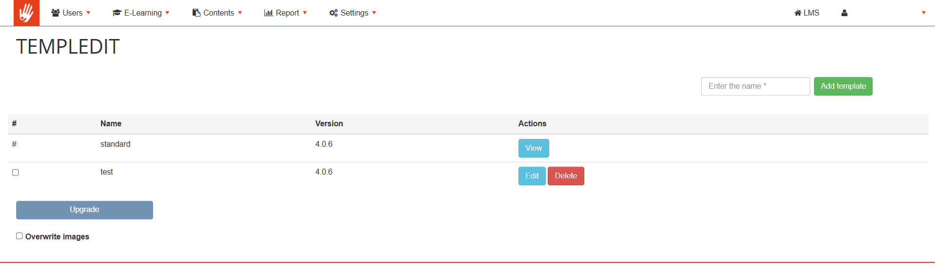
Add new template: enter the name of new template and press the "Add template" button: a copy of the standard template is created, ready to be modified.
Update Templates: in some cases, platform upgrades will require to updated some template core files. Use this button to update your templates to the latest versions while maintaining your style anche images changes.
Overwrite Images: selecting this option when updating a template, also the template images folder will be owervritten. Useful if you manually replaced template icons.
Setting your platform standard template
Last step, to set the created or modified template as the default template you need to go to: administration (gear wheel) > settings> system configuration > settings.
In the Main Options tab open the "Default Template" drop-down menu and select the desired template.
Template Settings
Once created, you can configure your template by clicking on edit, you will then be able to:
· Set the basic colors of the template (see legend below)
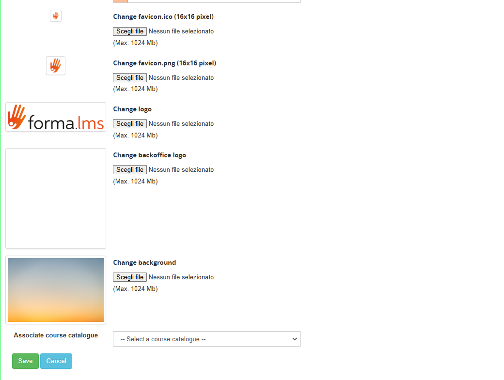
· Upload logo, cover image and favicon
· Edit the custom.css file: all styles in this file will overwrite the standard classes and colors set in templedit.
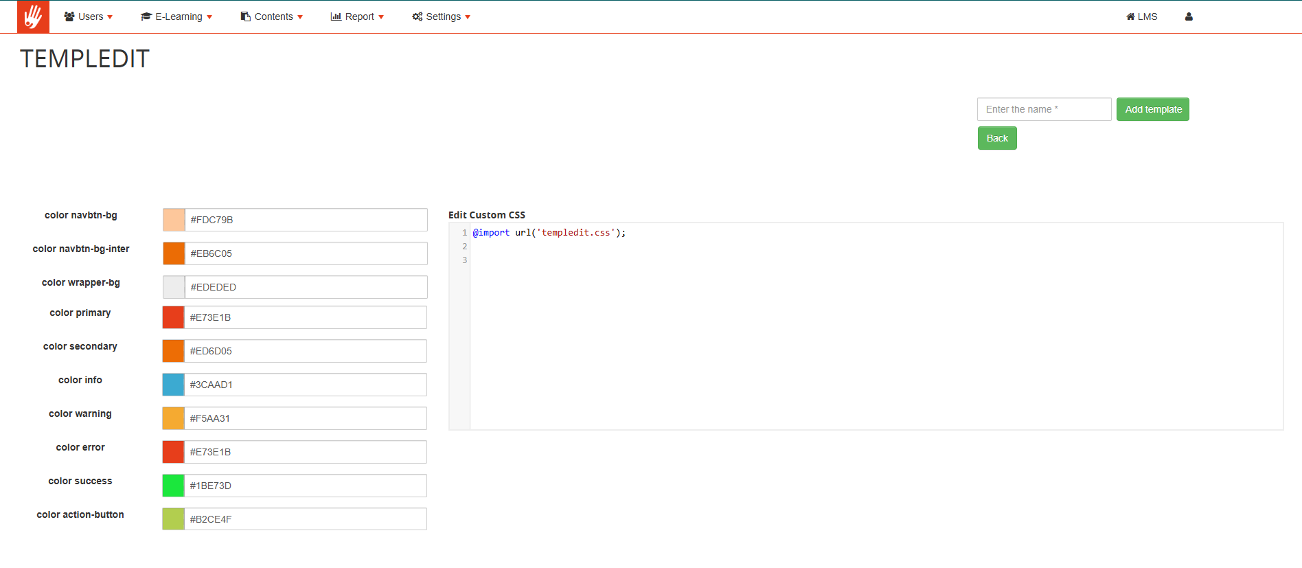
Note: do not remove the first line @import url('templedit.css'); which is added when you first save the template
Color Legend
Below is a small legend of the color entries that can be set to help the user set their own style.
We have set the various fields with different colors to make their display clear.
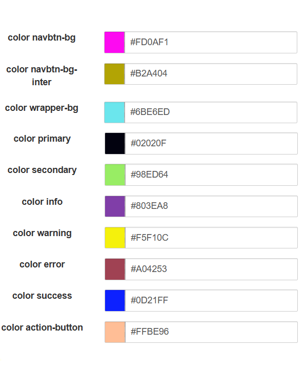
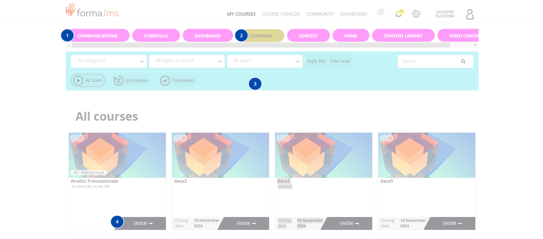
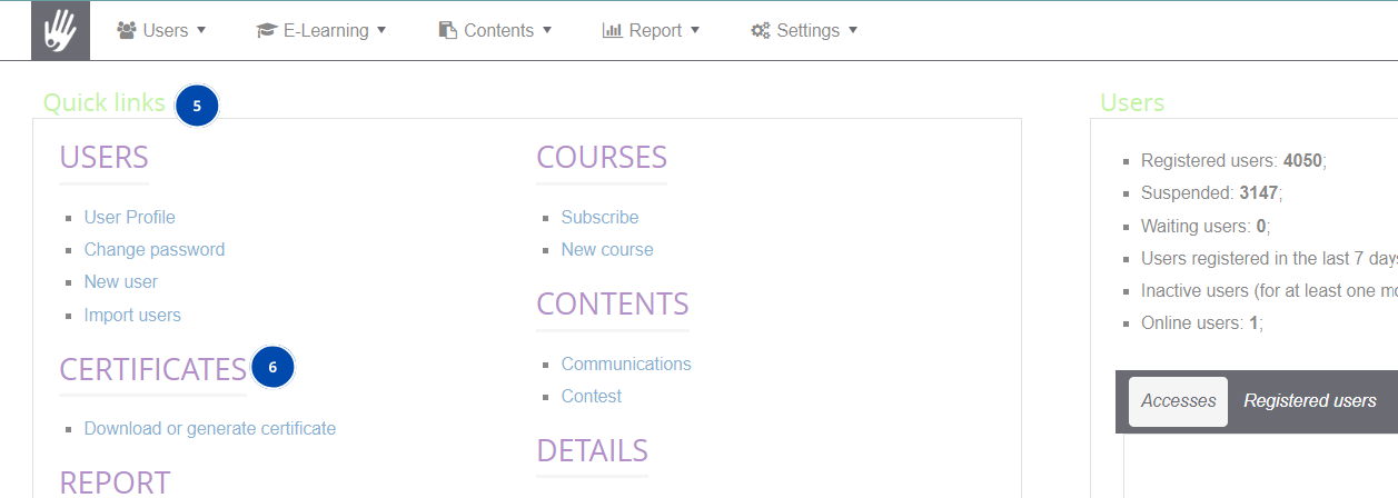
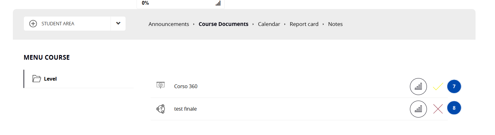
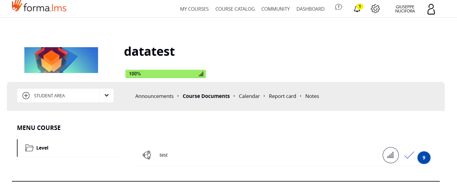
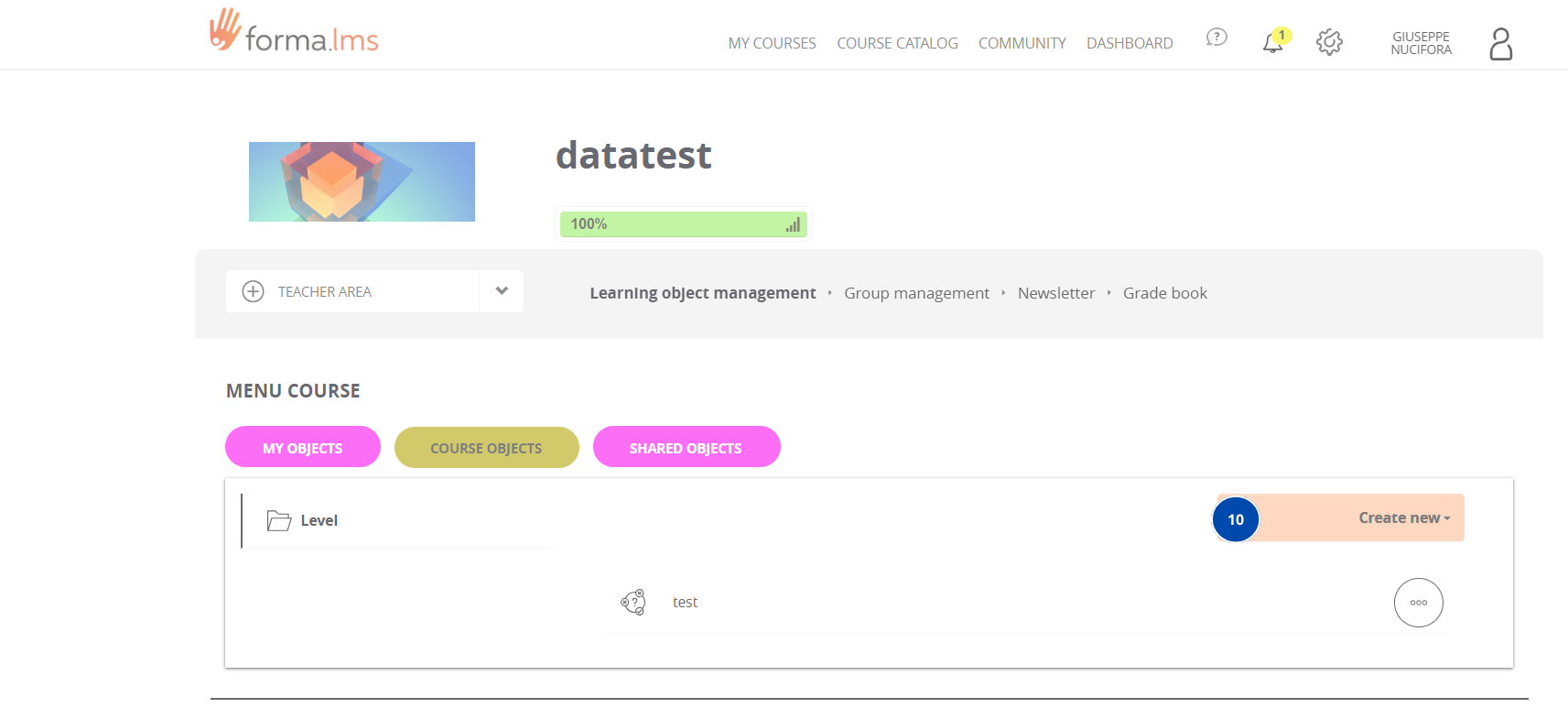
The legend above is intended to guide the user in setting up their own style for the platform, the images used serve as examples and it is possible to find any tabs, banners, etc. in other parts of the platform.